Odeto Shishkin
Overview
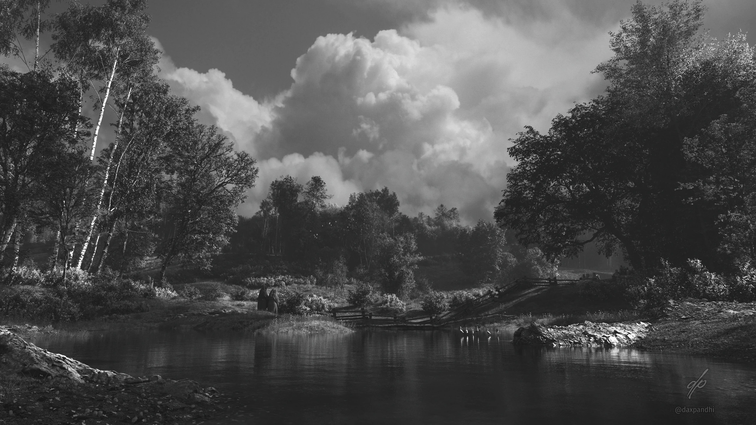
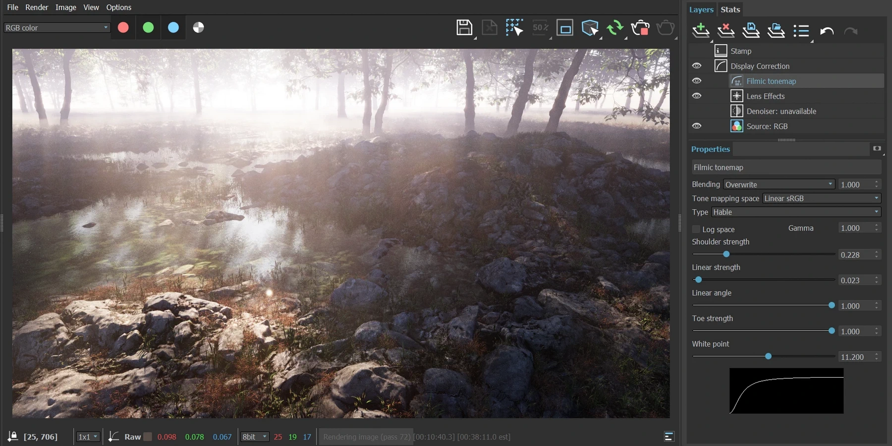
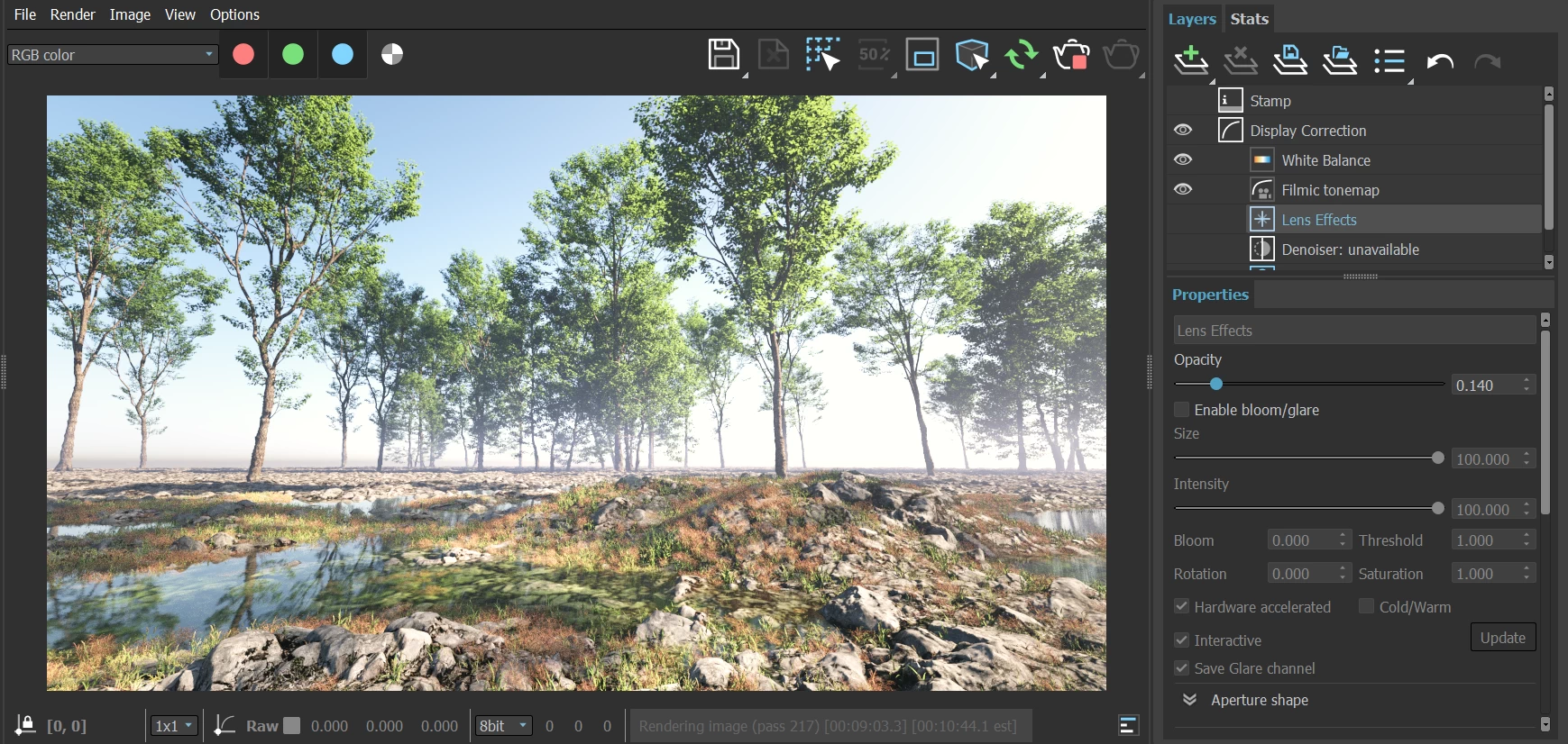
This series of renders were created to be realistic yet painterly. I was adamant that there be no post-processing and everything should be achieved in-camera.
Ivan Shishkin has been a big influence for my art style. His depiction of nature has a beautiful balance of stark, bare elements that still reveal the gentle, harmonious shapes of the living world.
Over the course of several years, I made several renders inspired by Shishkin. With each iteration, my understanding of light increased. In fact, I would say at least half of the quality of these renders comes solely from the light.
Every scene had a single light source. It was important for me to not fake any lighting and achieve the look soley through direct light and global illumination.
To ensure that reflected light was as realistic as possible, I created extensions of the landscape (including trees) behind the camera and beyond the frame. These trees helped with shadows coming from off-screen to depict a world beyond the frame, and reflected light from behind the camera with an accurate color.
Pipeline
- Autodesk 3dsmax 2023
- Chaos Vray 6
- iTooSoft ForestPack 8
The Evolution
In 2021, stuck inside during the pandemic, I craved nature and wanted to try something bold and new. Shishkin has been a great influence on me, and so I decided to try and create something in his style. I poured over everything I could find that he painted.

First Octave
In April 2021, stuck inside during the pandemic, I craved nature and wanted to try something bold and new. Shishkin has been a great influence on me, and so I decided to try and create something in his style. I poured over everything I could find that he painted.
It was not easy to replicate. Shishkin captured SO much detail in his paintings, it was hard to even figure out how to start.
I rarely have a visual end-result in mind when making my renders. Mostly it is just a feeling, style, light, or palette that I want to capture. The shape of it develops as I play with the scene and move it forward intuitively.
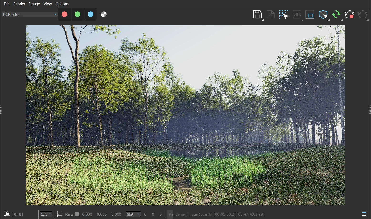
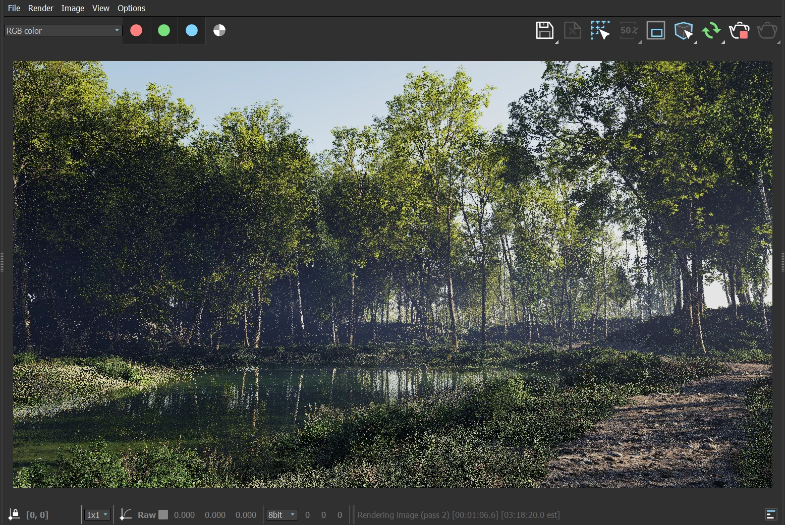
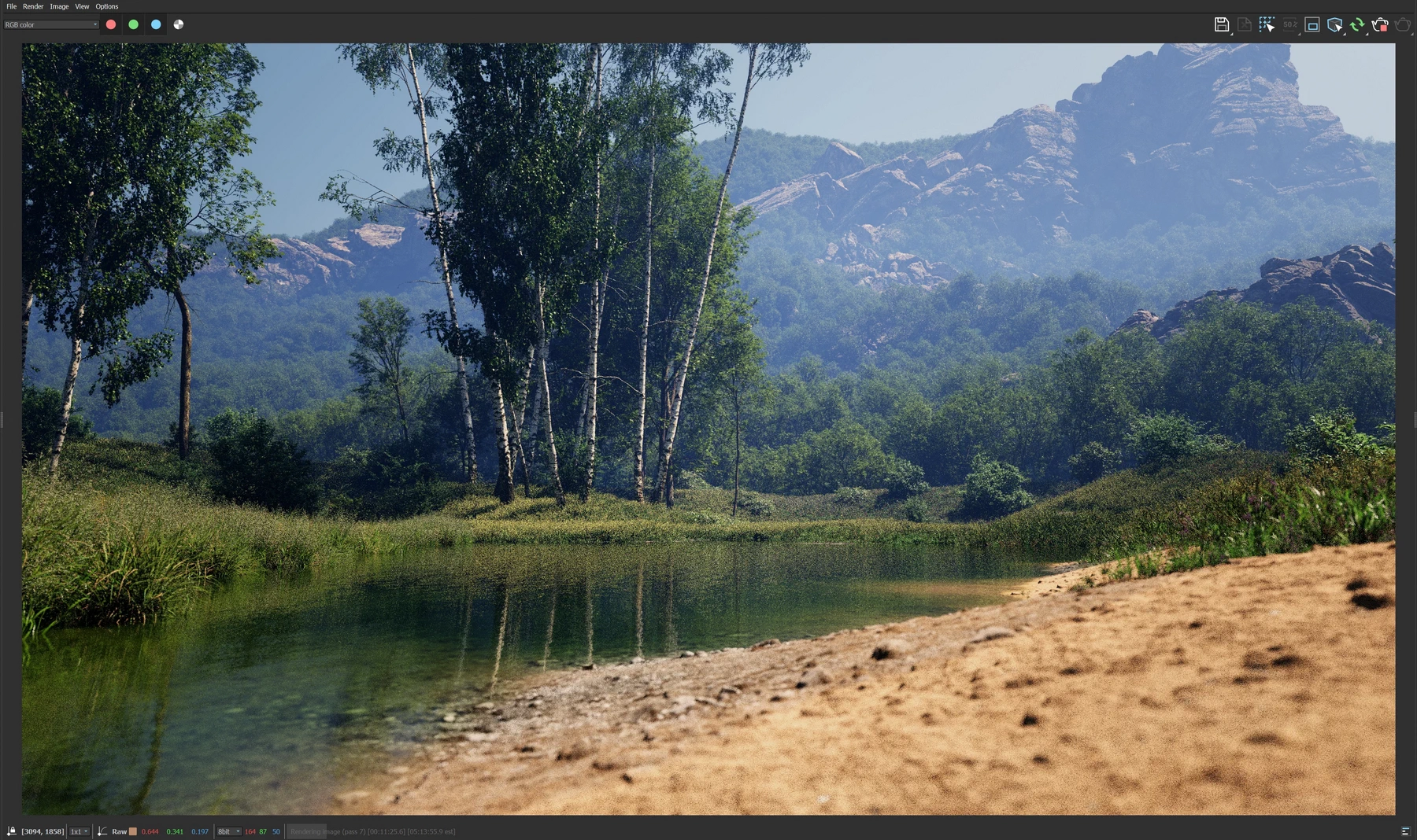
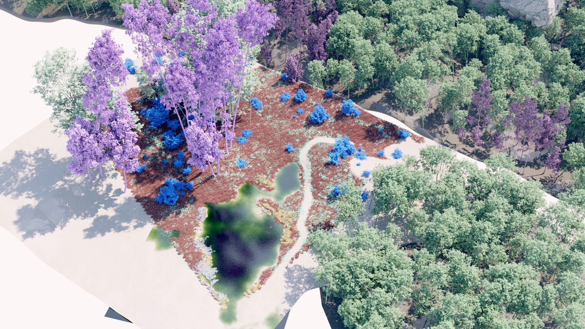
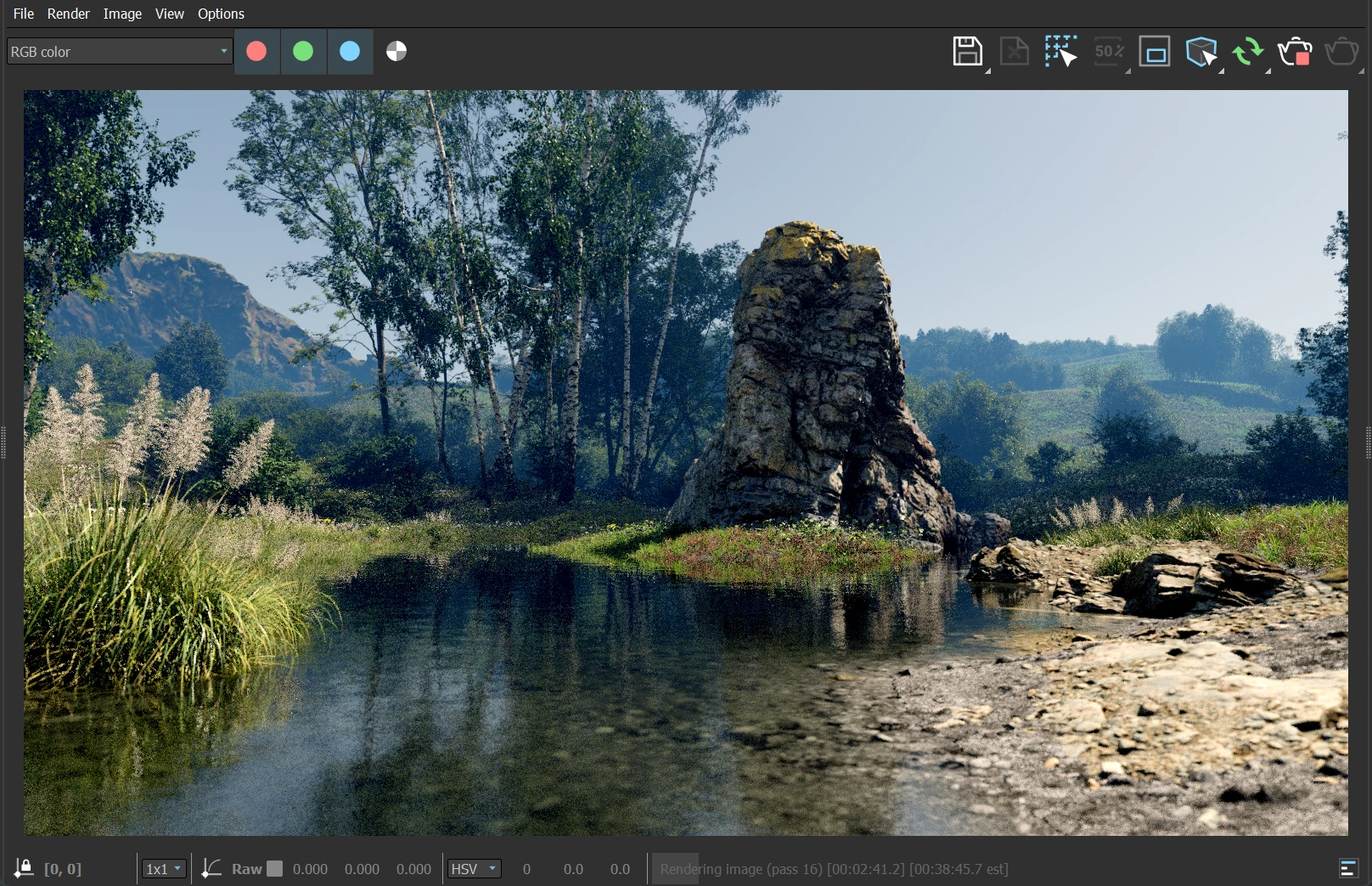
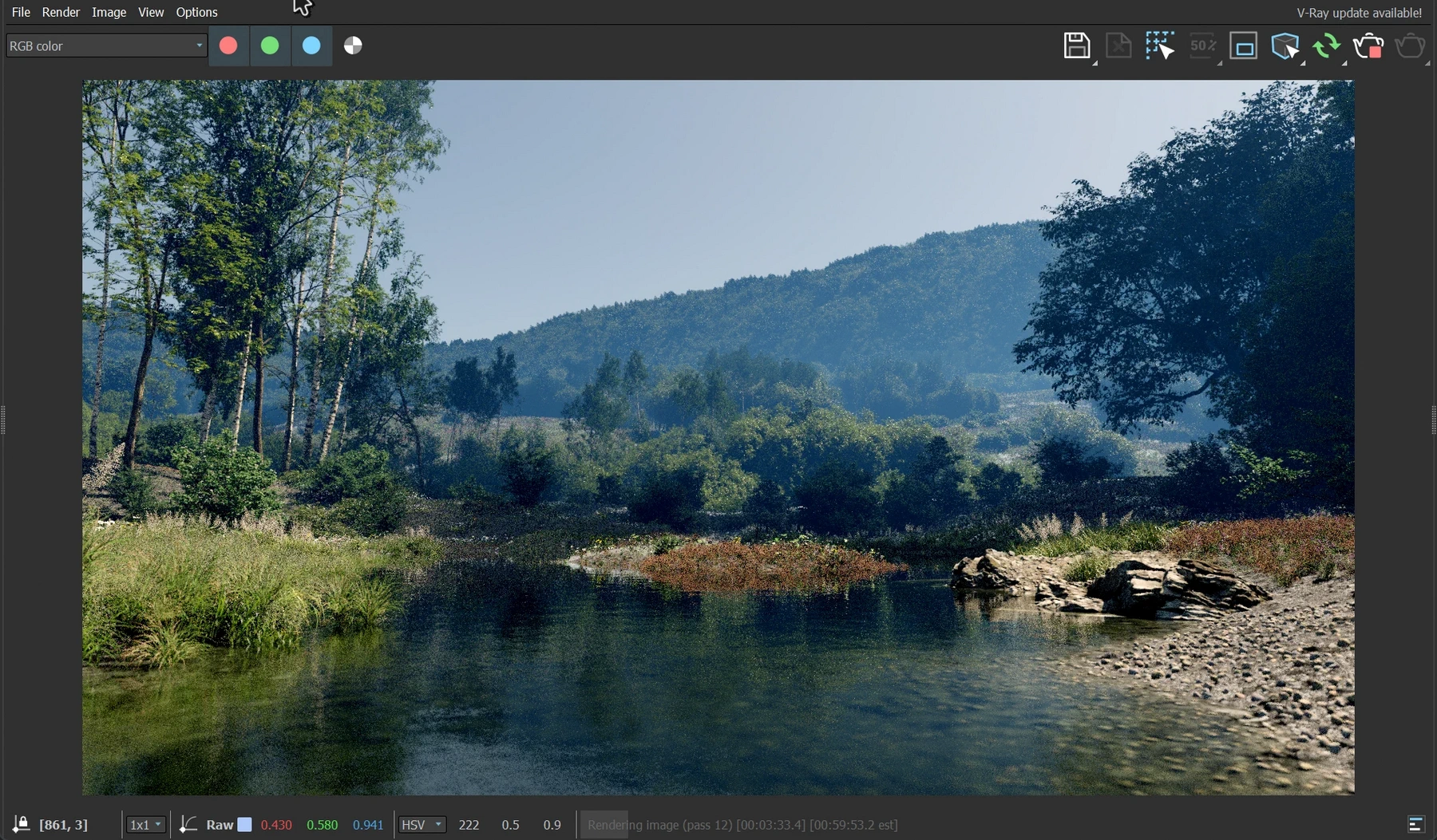
To start, I made a displaced ground plane with heavy rocks. I manually shaped the terrain with soft-selected vertices and FFD transforms. To add some interest to the frame, I added a water surface. I added several trees, not for their visual but for their shadows to control the untamed brightness of the ground plane.
This gave me a good starting point. As usual, whenever I get to a satisfying point in a scene, I will move the sunlight around. It does not mean necessarily finding a new light angle. In fact, most often I'll reset it back to what I had previously. By changing the light, the "volume" of the scene becomes visible and you get to see the elements differently.
In this case, I changed the light so it came in from a high from the right-side outside the frame. Mid afternoon almost. This sparked the composition. Right heavy scene leading into the horizon on the left. The shadows had to be as important as the trees themselves.
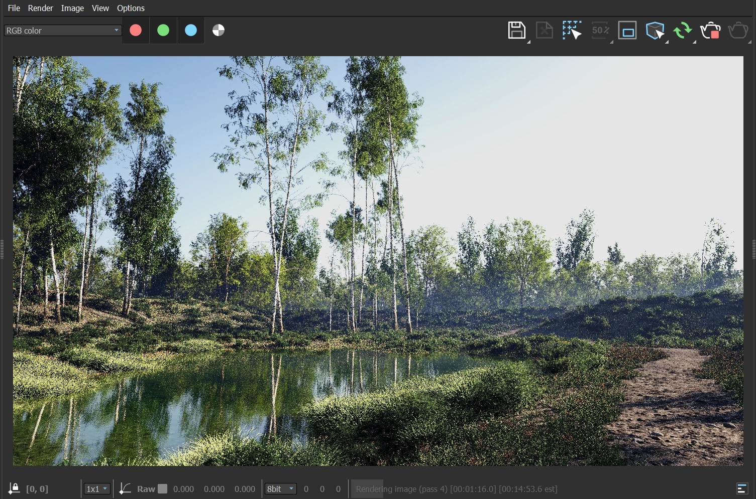
In these images you can see how the scene quickly evolved. It was mainly about building the layers of vegetation. (I will go more into detail about that later.) The sunlight was modified once the final elements were in place to make sure the right tree instances got light.
It is very helpful to have multiple ForestPack populations for the same layer/species. Especially when you want a few specific trees to get special lighting. You can use different seeds and transformations, and when you need full manual control you can convert those few trees into editable instances. The rest of the forest still remains procedural and does not box you into manual management.
I was very pleased with the result! It was going back to my roots of telling a story through the environment instead of having some monolithic object or character dominate the frame.
Second Octave
Coming hot off the previous scene, I wanted to make another scene. As usual, the moment I published something is when I immediately start seeing all the flaws or missed opportunities.
Apart from the hundreds of little things I could do have differently, my biggest gripe with the previous render was that it felt "isolated". It didn't feel like there was a world beyond the frame.
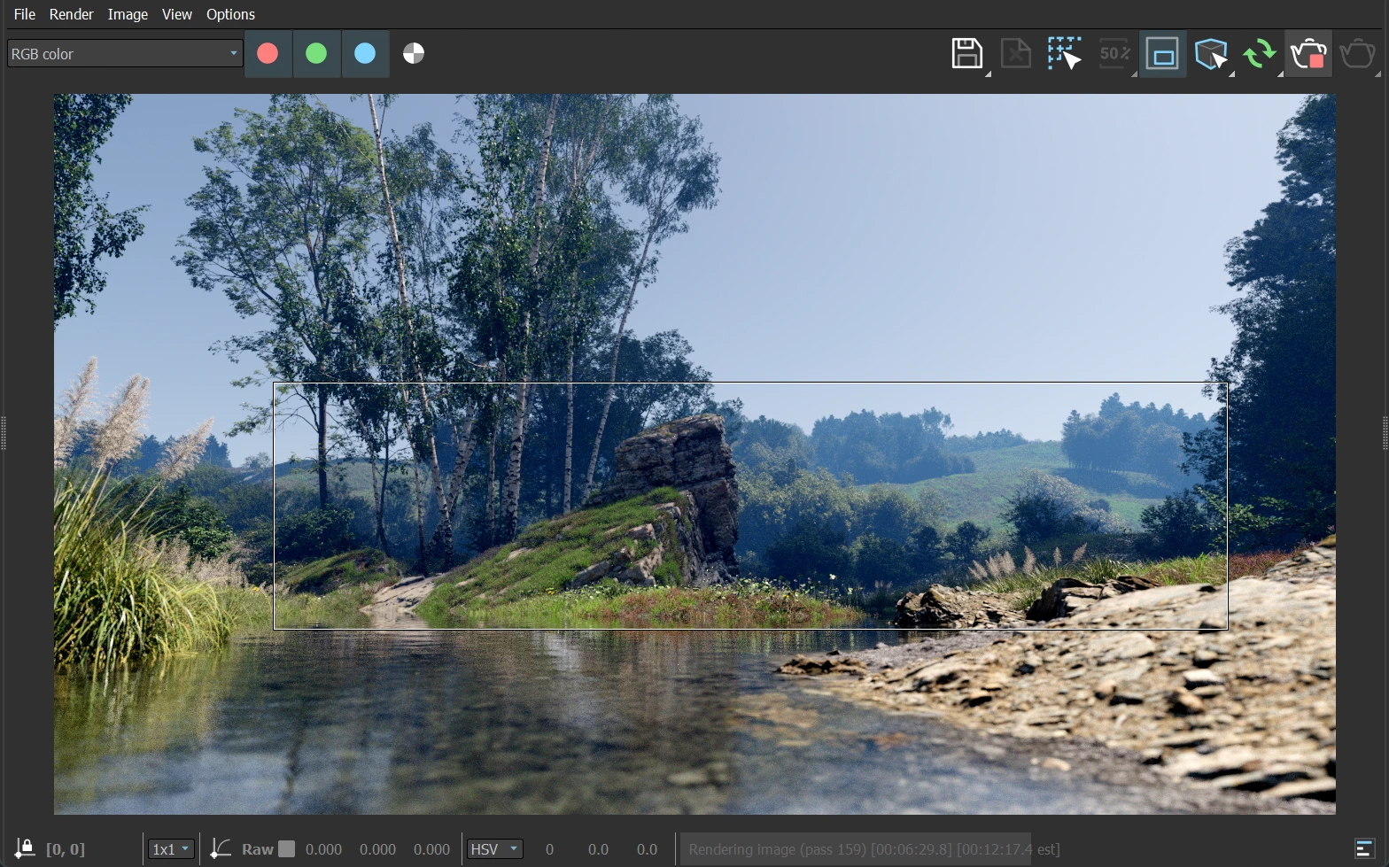
I decided to widen the frame and create a grander composition.
Instead of a new fresh scene, I removed most of the objects from the previous scene and used it as my starting point.
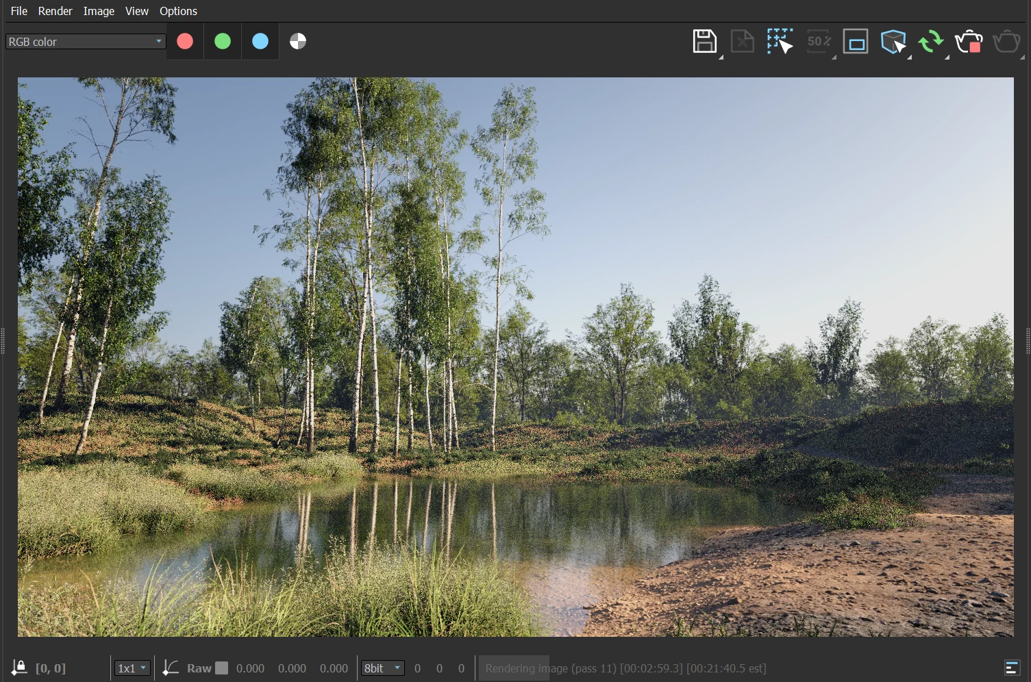
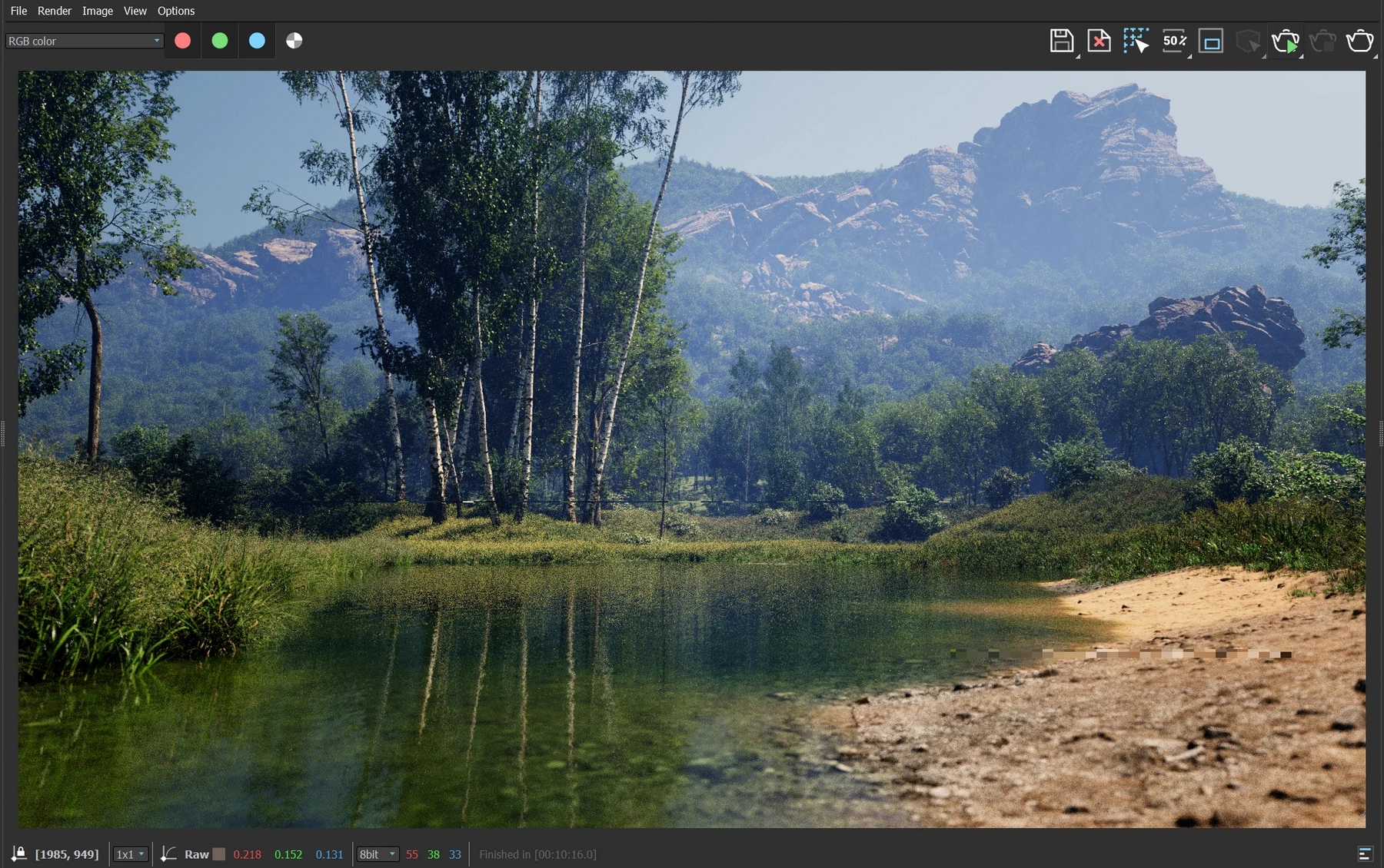
Instead of the bumpy forest floor, I made the ground more dirt-like and flatter. To start feeling my way to a decent level of grandness, I made a large grove of trees in the distance. They would be my "measurement".
The grove felt too dark, and in some ways too similar to the previous image. So moved the trees further back, behind the foreground terrain. They sat on a flat object hidden by the foreground. By sinking them lower than the horizon, it made them feel like part of a larger forest behind the immediate foreground.
A small bunch of trees were left in the foreground. They were the perfect focal point. They conveyed the scale between the foreground and background while anchoring the composition.
I absolutely love the white Birch trunks if you haven't noticed yet.
The foreground came together relatively quickly. Layering of multiple species at various levels of depth, and strategically placed trees at the edge of the frame added that "world beyond" that I failed to create in the first iteration.
Here I want to talk about the failures that I didn't talk about in that article. To add more depth, I tried desperately to add a large distant terrain. Several attempts failed, but I kept trying to add it. In the end I ended up with a mix of hand-sculpted (FFD hell!) terrains covered with trees, and some scanned objects jammed in there to add complexity to the shape.
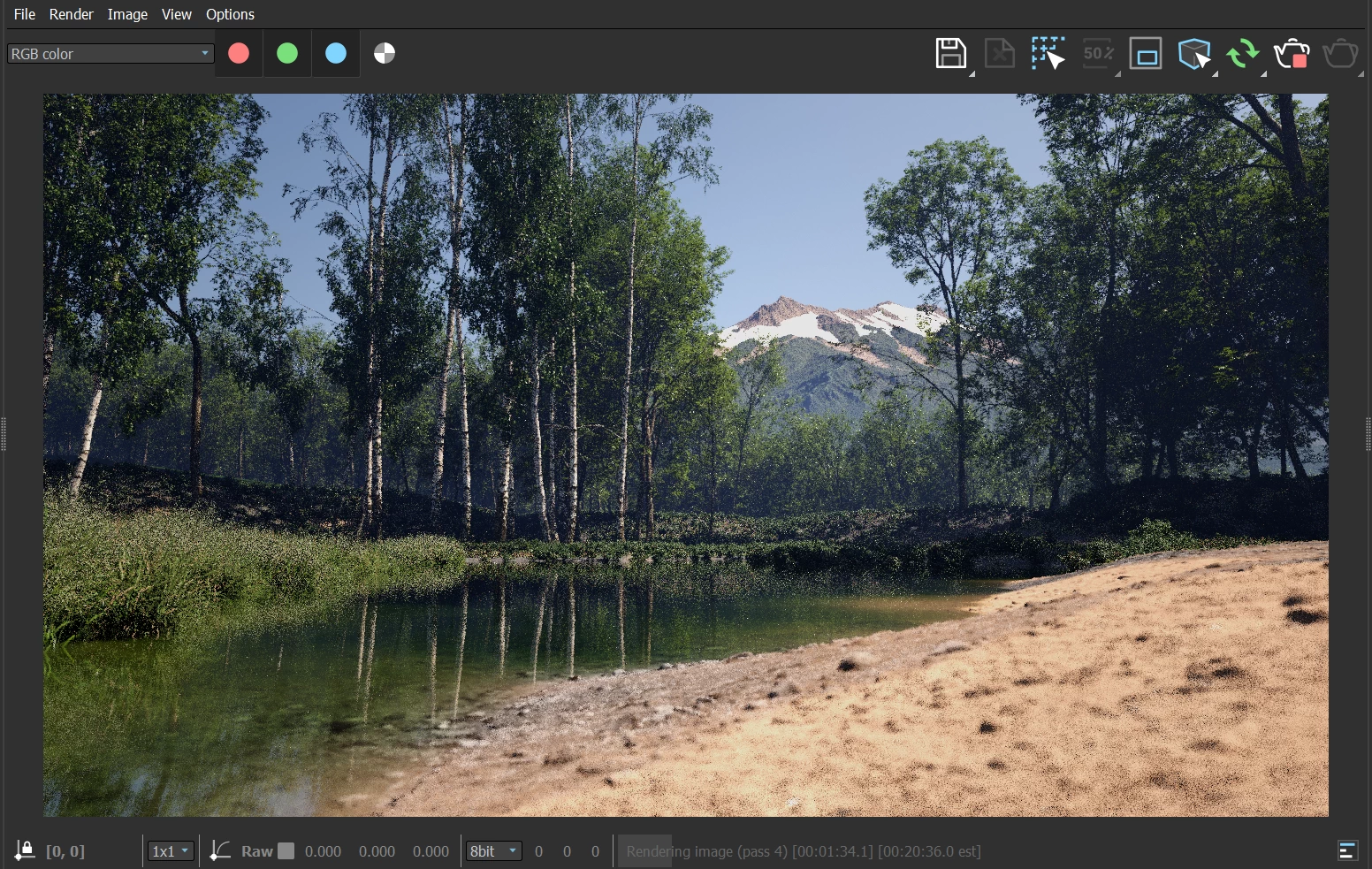
This was a clear mistake. Look at this discarded attempt. I should have stopped here. Or even better, removed it completely.
No, I went even further and added a terrain behind the large background terrain. Layers/depth add a sense of grandness, but these terrains were causing problems I was too close to see.
The mountains were skewing the scale. They were stealing (or at least confusing) the focus from the middle ground.
I removed the super large terrain in the background, but kept the other one.
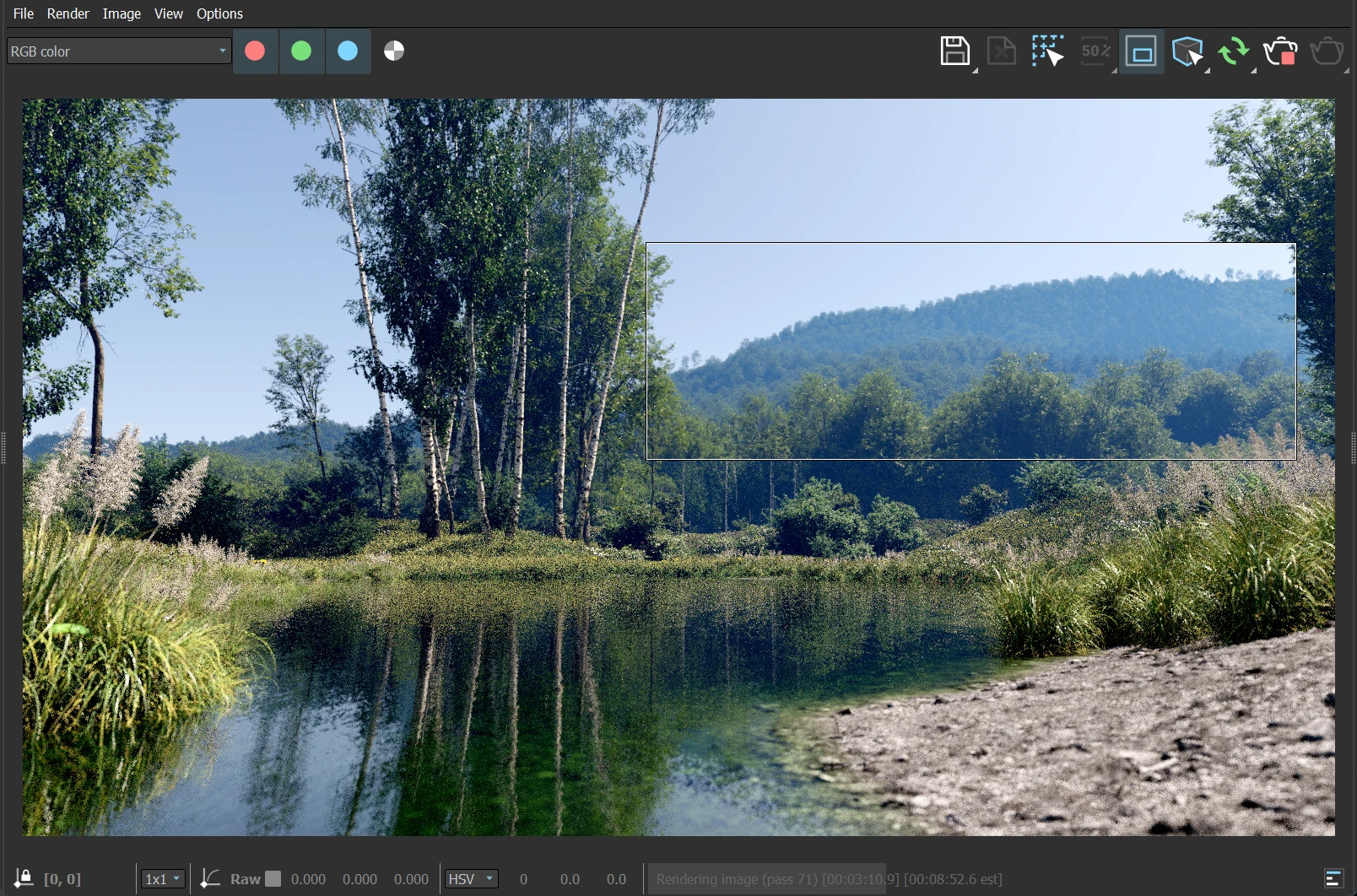
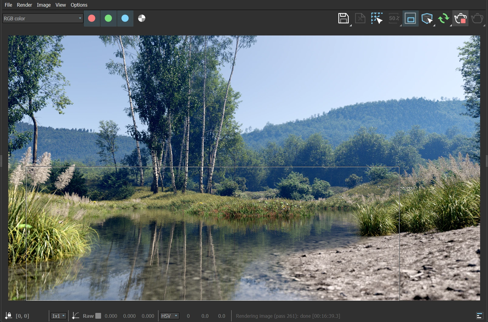
It had been 10 days already! I wanted to be done with it! So I tweaked the background terrain and objects as best as I could and fired off the final render at Ranch Computing.
There were a few minor tweaks in post and it was published! People loved it, and I was pleased. Mostly. The composition kept niggling at me.
But I moved on.
Final Octave
Almost exactly 2 years later, in April 2023, I picked the scene up again. I felt like I had missed its greater potential.
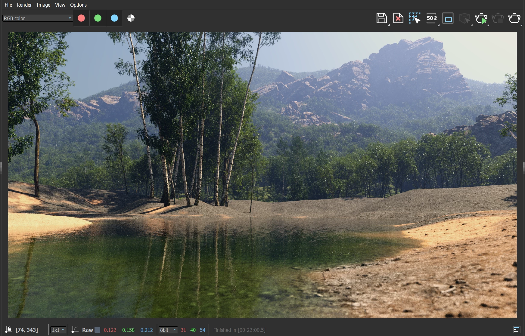
Simply adding a less-detailed but better scaled mountain in the back brought the image into balance! I was finally happy with the background.
But I had learned a lot in these 2 years on other work. So I kept staring at this seemingly "rectified" background. What was wrong?
It was flat.
I tried modulating the terrain to create better canopy falloff and layering. It still felt off.
Opening my Shishkin library, I started studying his work again with fresh eyes. And it suddenly was obvious - my lighting was flat! The shape of the hills didn't matter. Not the density/patch placement of the forest. Everything had turned into a single, noisy mass of green.
To test this theory, I changed the lighting and several portions of the distant forest immediately looked better. My lighting WAS flat.
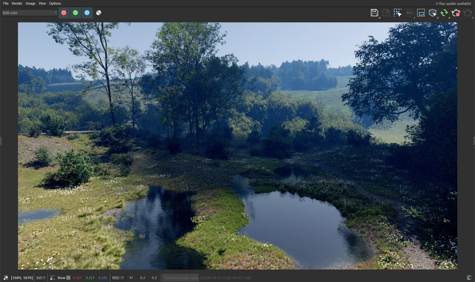
First, I lowered the height of the distant terrain. I needed it to take up less space in the frame. Also, having it stretch further "into" the frame rather than vertically would let me control the visible depth of the scene. It meant having LOTS more tree instances, but that was worth the price.
Second, I made a flattened sphere and placed it high up in the sky between the sun and the camera's view. It created a "cloud shadow" in the distant forest. Anything outside the frame that can affect the contents of the frame automatically tells our mind "there is something beyond this frame" and gives us that larger, connected world.
The background terrain became more rolling. The endless forest was turned into patches of trees and LOTS of lush grass in between.
I played with the background through several iterations - often trying to place a large terrain or rock formation with exposed rock to break up the monotony of the green forest. But this was going down the wrong direction. Eventually, I realized that each shape that did not directly contribute to the feel I was going for was just CG decoration.
There was still no focal point or a story in the scene. It was still just a collection of pretty tree populations.
I brought in some rocks from , favoring a few monolithic formations. After moving
it around A LOT, I still could not get the "story".
At that point, I gave up on the rocks and deleted every rock formation across the scene. I took the camera several meters up in the air.
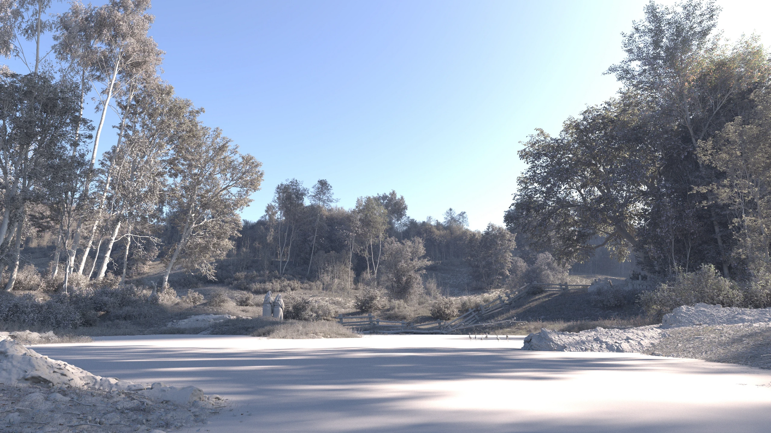
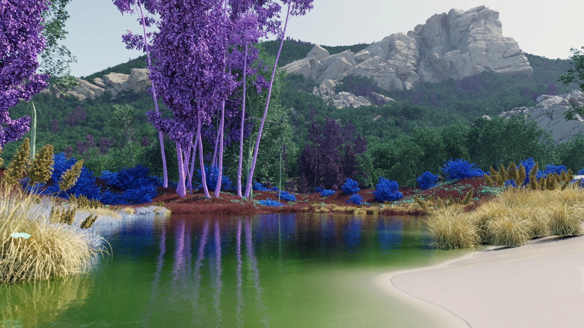
Moving the camera, flipping the image horizontally, or making changes to the point-of-view in some way is a great way to perceive your scene in new ways.
While I have never painted en plein air, I've been photographing nature for decades. So I tried to tap into that mindset. As a photographer, you can't make modifications to the scene, you just have to frame your photograph in a way that makes the most out of the natural opportunities in front of you.
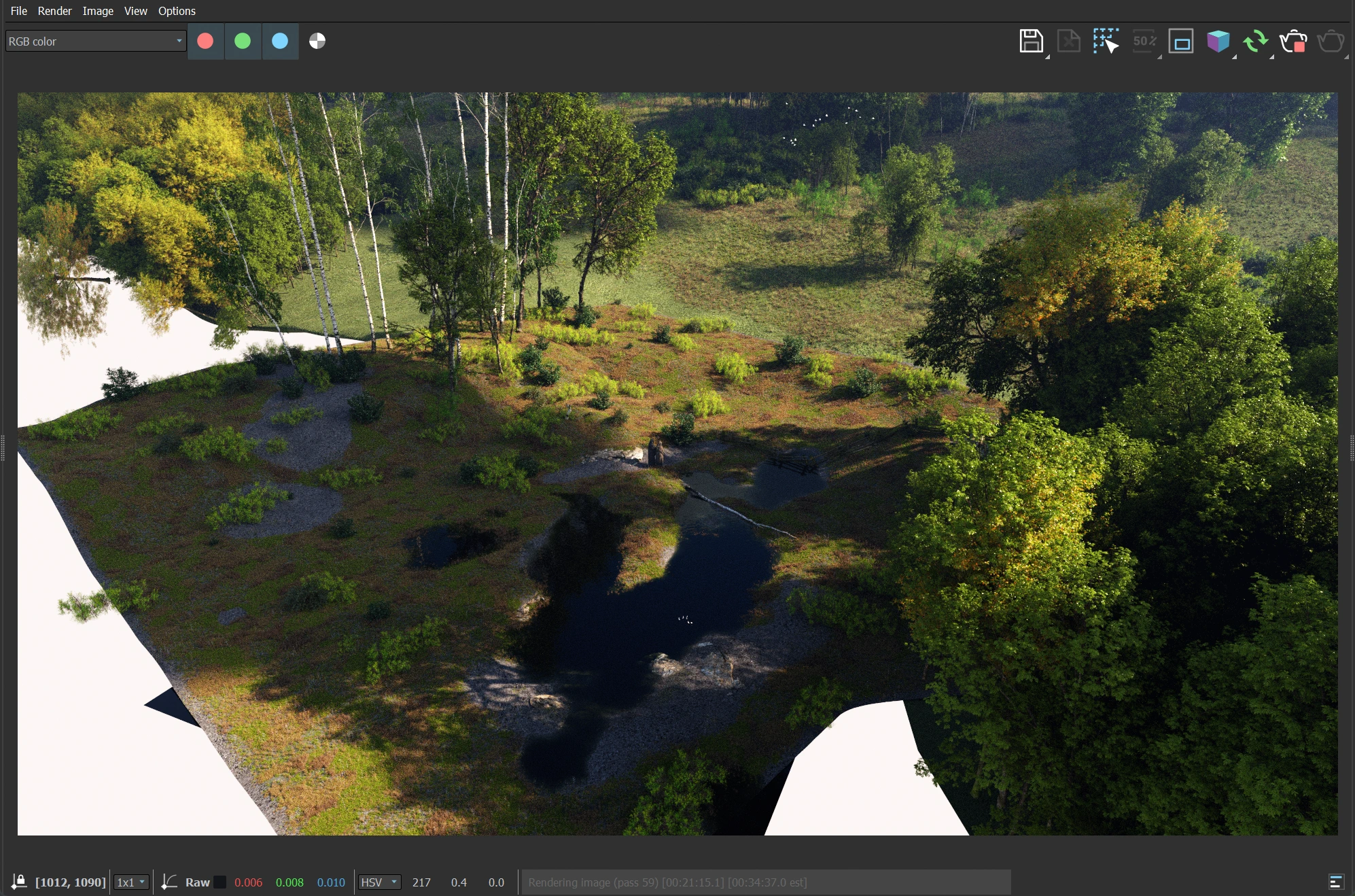
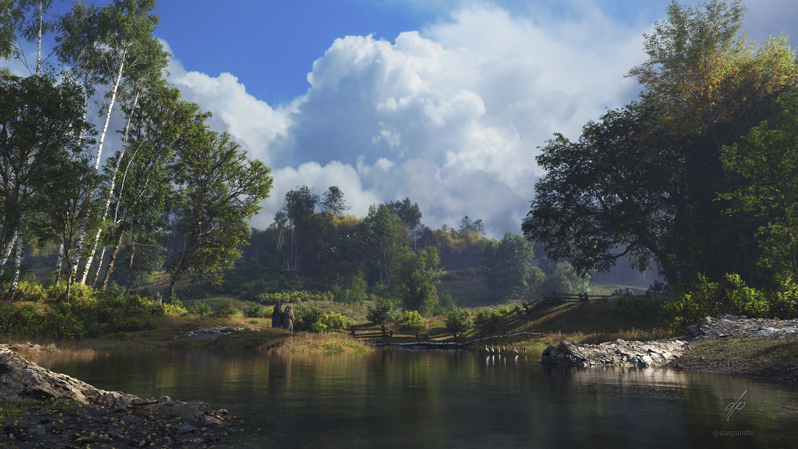
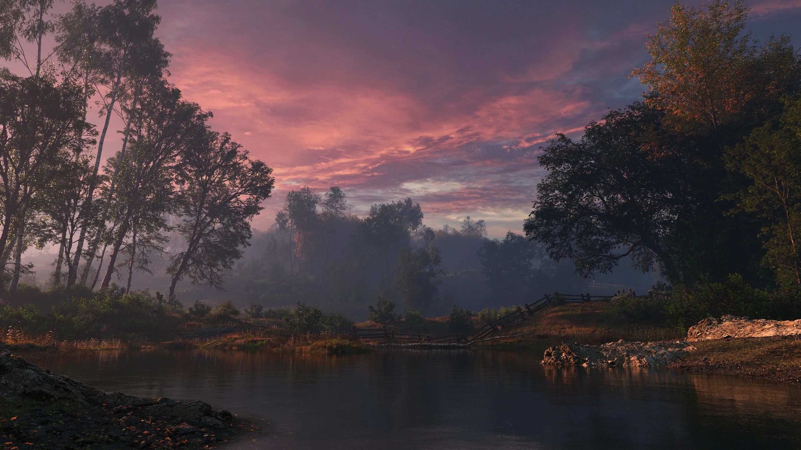
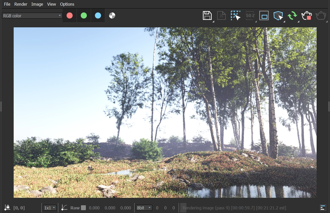
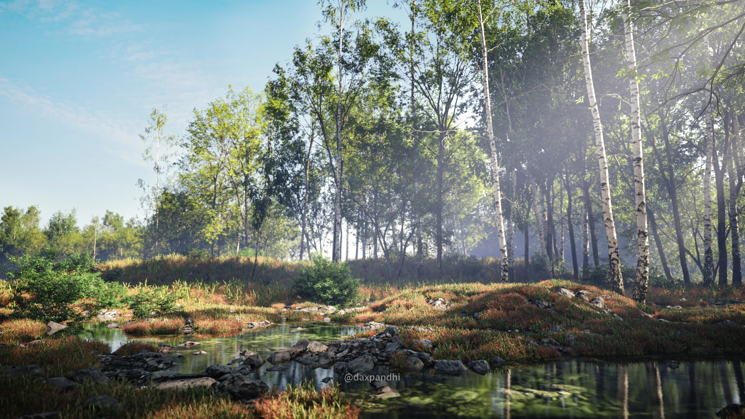
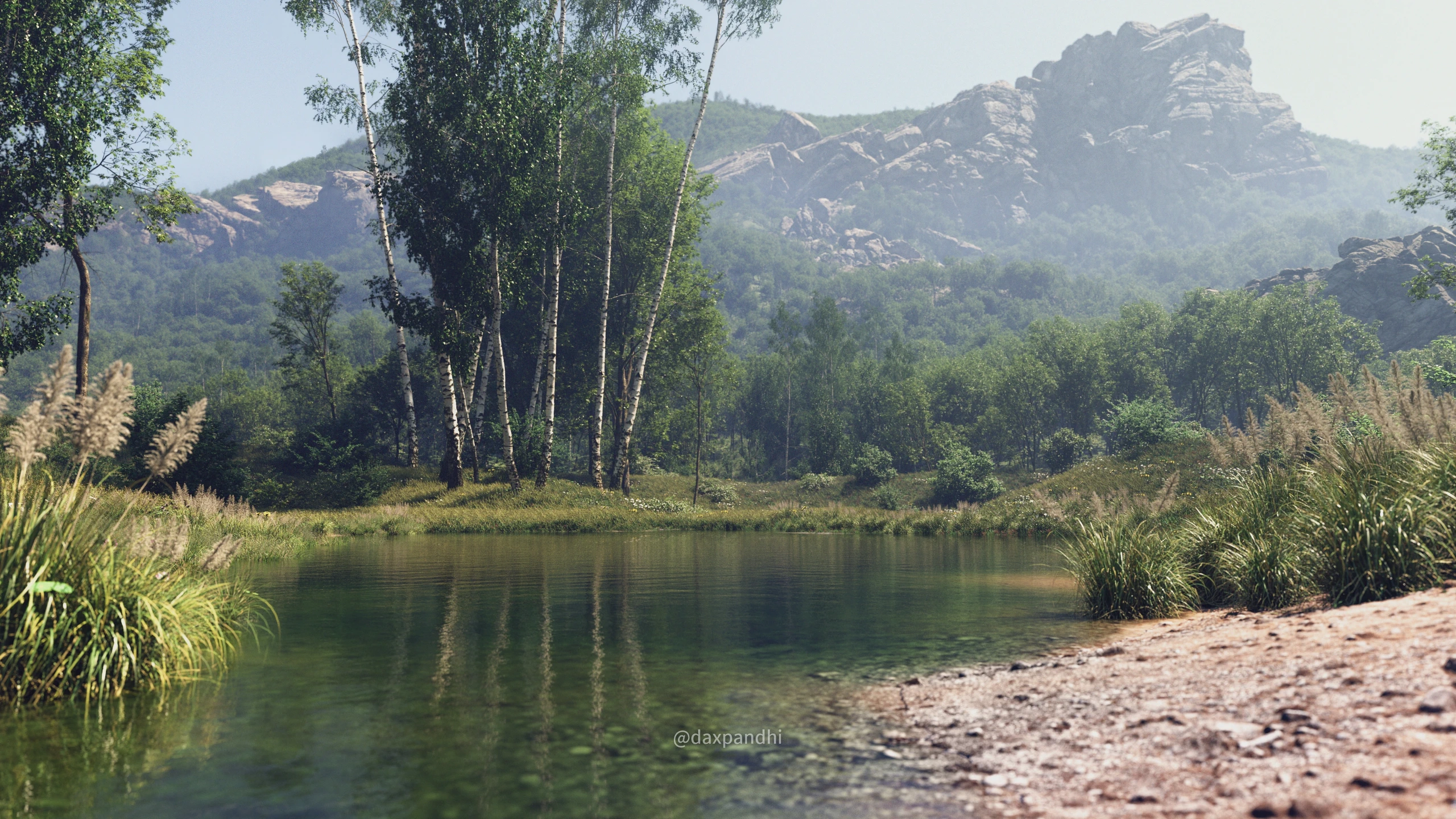
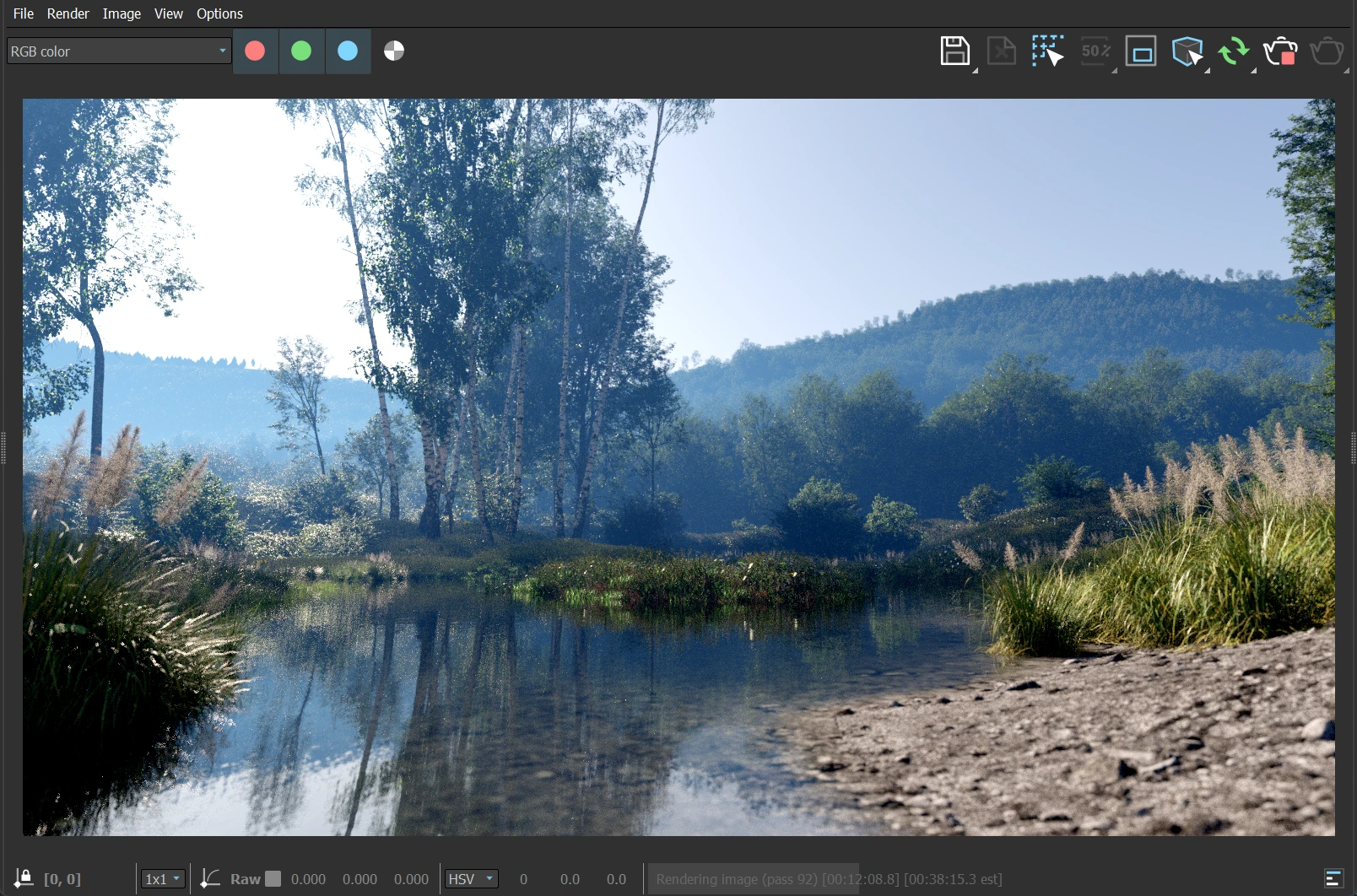
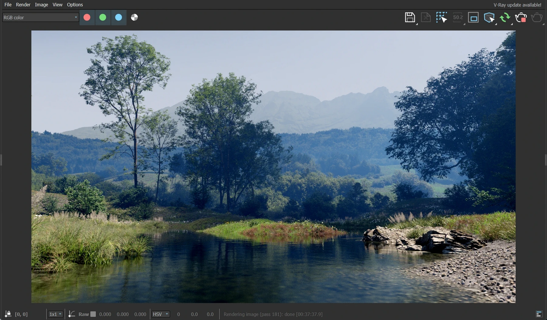
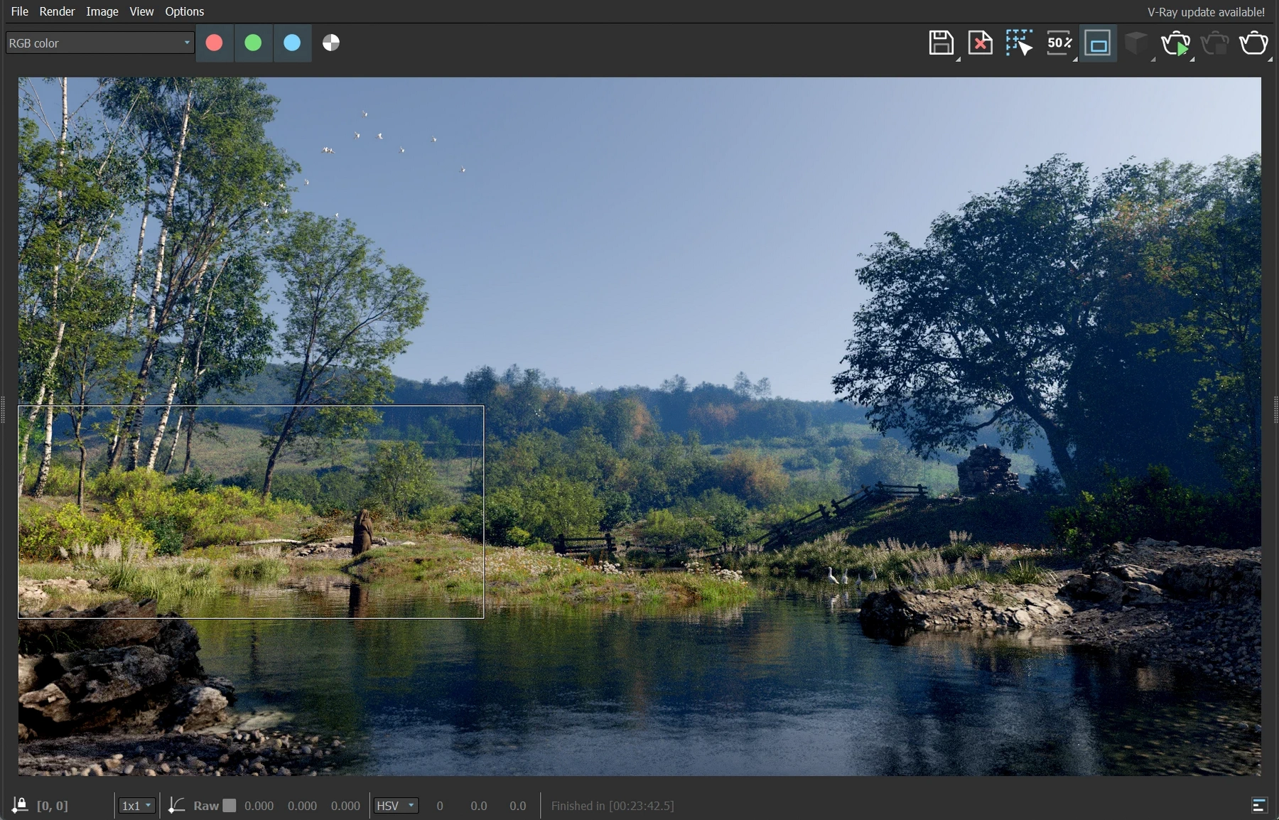
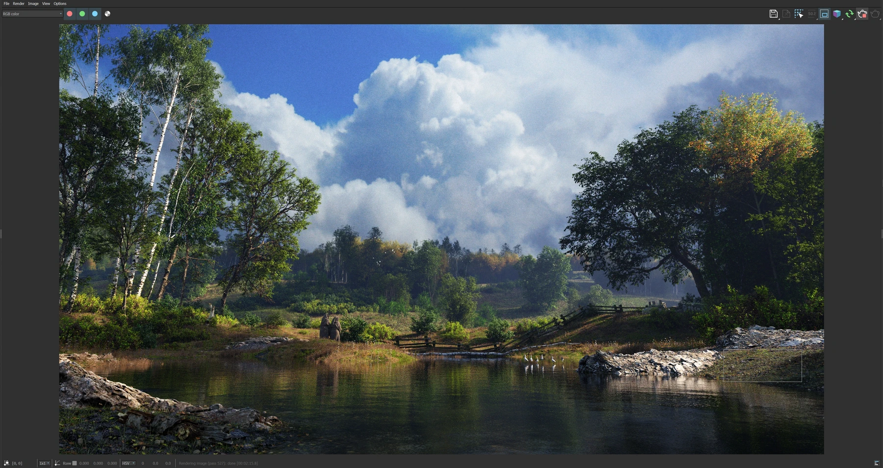
The shadows in this new angle gave me the story. Light would again become the central "character". I'd divide the frame into light and dark areas. The composition was altered to move the large trees in the frame center to the left. The large shadowy tree on the right would remain.
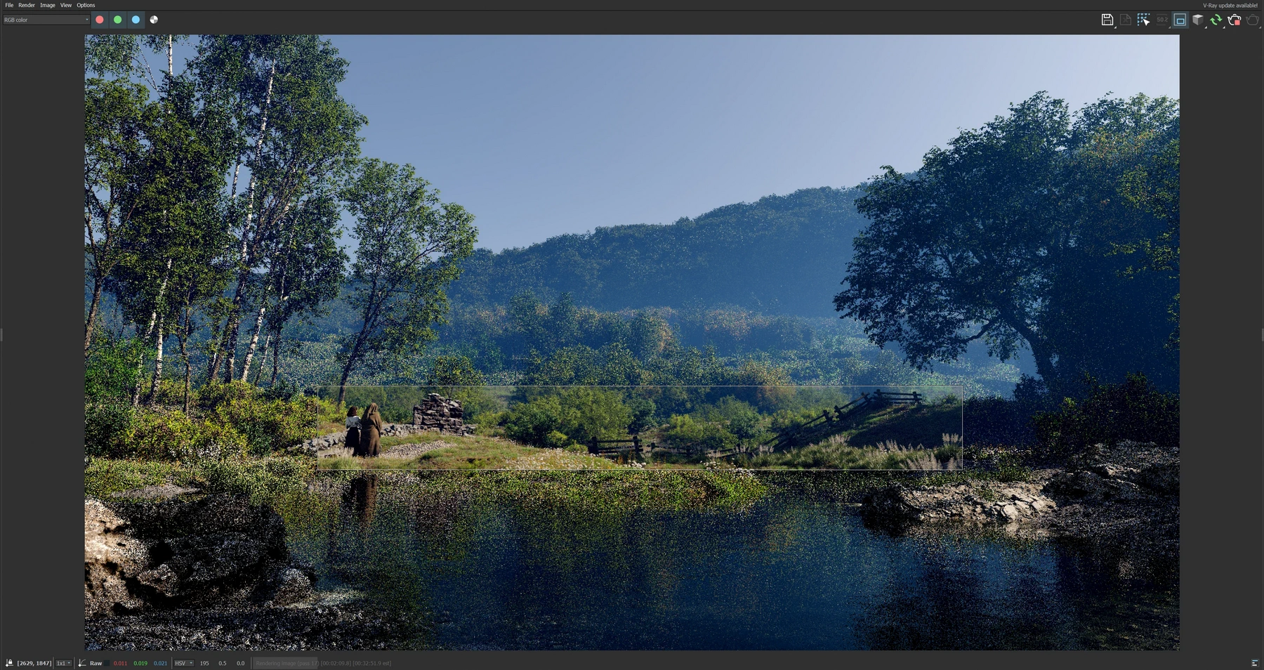
The space between was opened up and that gave new opportunities for the distant forest. The distant terrain was flattened a lot more, and a new hill was created in the farther background. This terrain was discarded quickly as I felt a hint of horizon behind the forest would convey a more open, larger world than a large hill looming above the forest. It also created an imbalance of shadow.
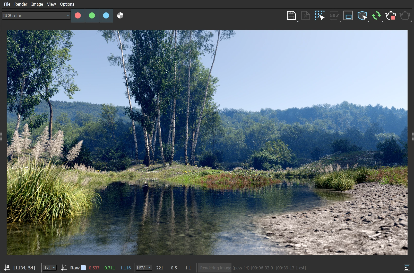
To add variety - both shape and color - I started bringing in new tree species in the far forest. Some had partially yellow leaves. They created beautiful silhouettes that conveyed depth and added more personality.
I went back and forth with this forest along with the foreground (described next) to create a realistic forest by making 6 different ForestPack populations that created semi-manually placed groves of trees. The fully procedural way was not giving the exact results I needed. So I chose the type of distribution pattern I liked, and then painted the small groves - often overlapping with other species.
A very large portion of this distant terrain was left open and populated with very dense grass. It still felt empty until a nice edge population of bushes and saplings were added.
During this entire fight for the background, the foreground was undergoing dozens and dozens of iterations every night. I only had a couple of hours each night after work to spend on this scene. And that too not every day.
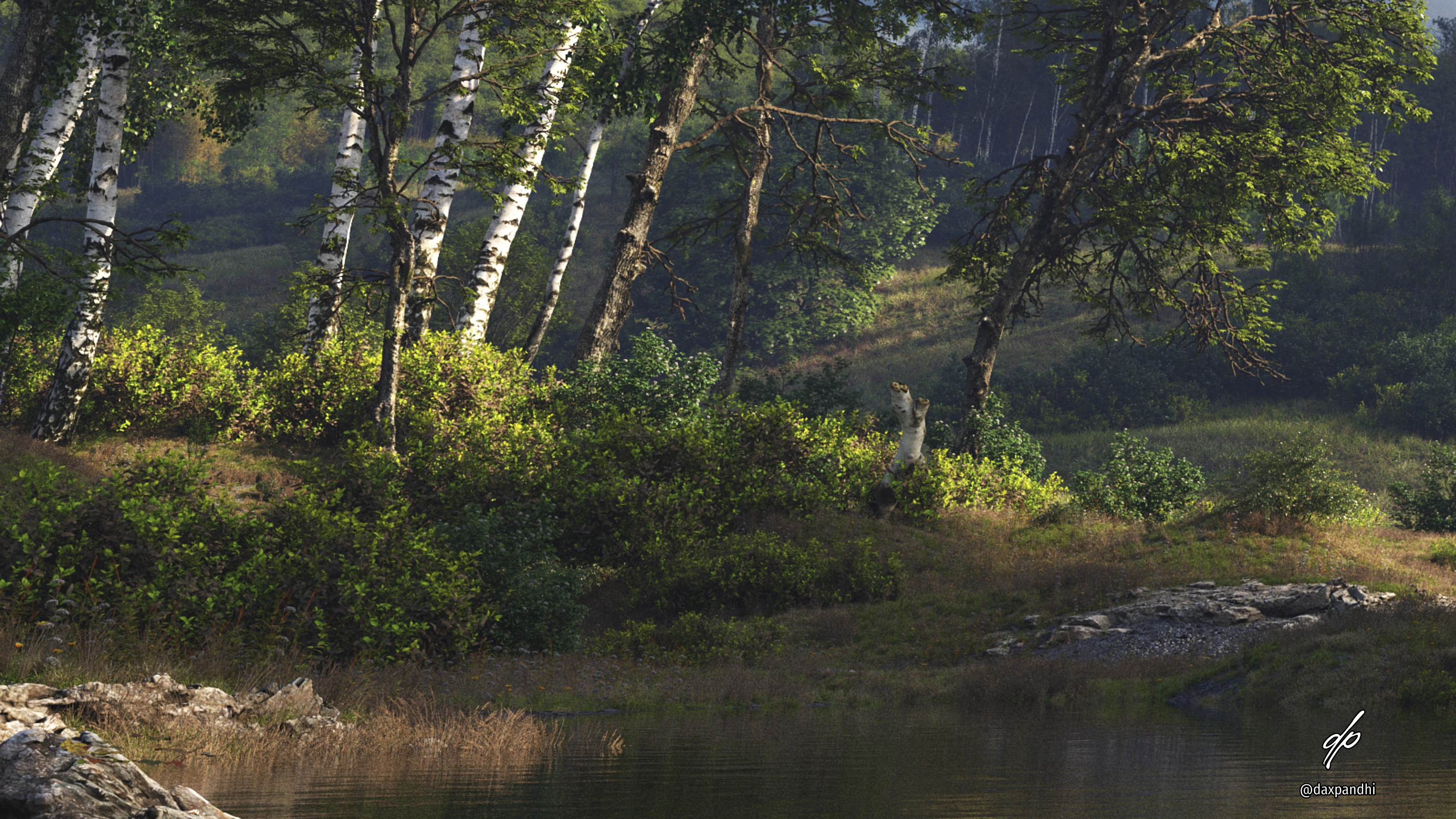
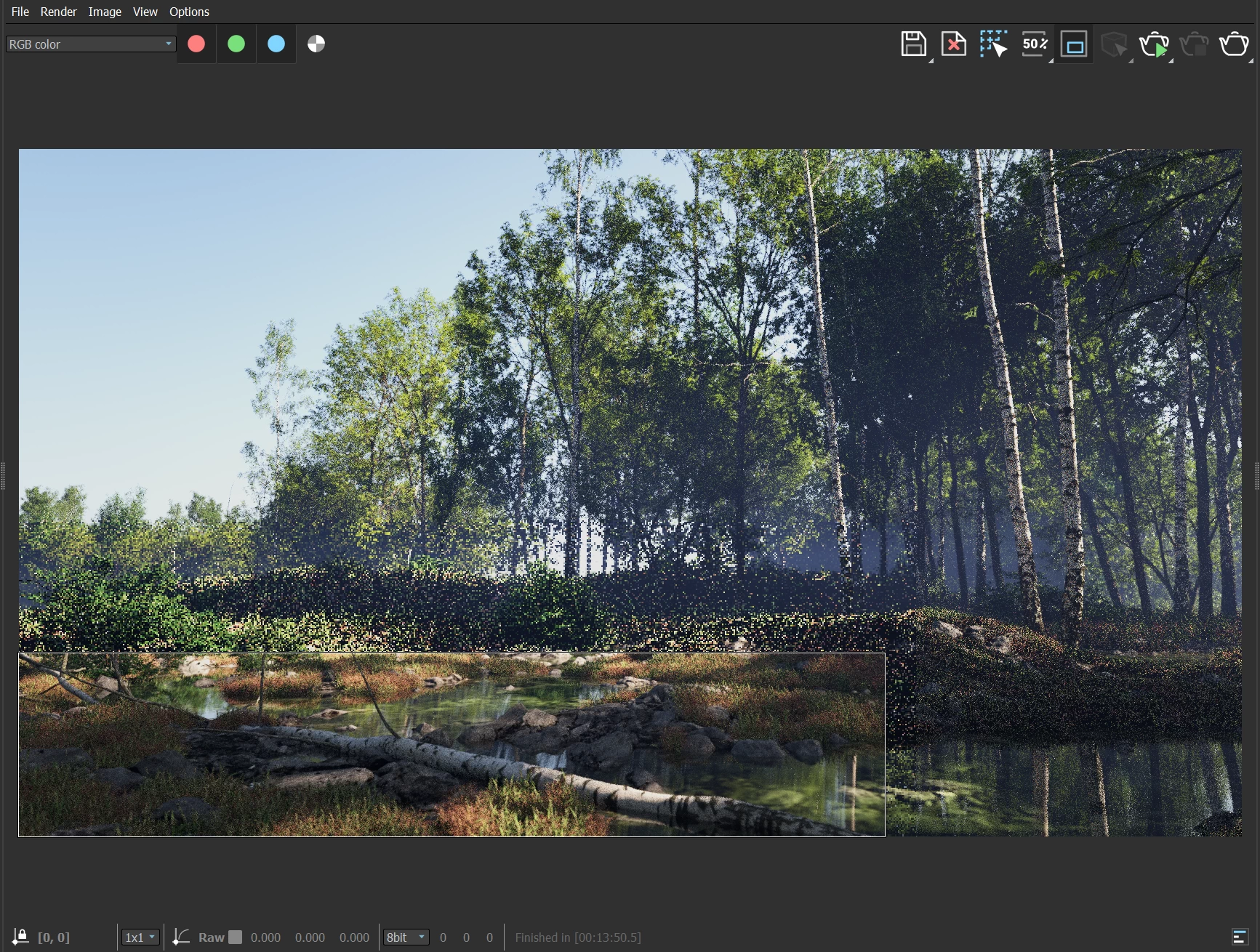
The reflecting pond became a very important factor to bring the whole scene together. The main trees went through a lot of minor tweaking repeatedly. In the end, they became real tree instances and not a ForestPack object. They were kept mostly like FP created them, but moved around precisely to create the most pleasing result.
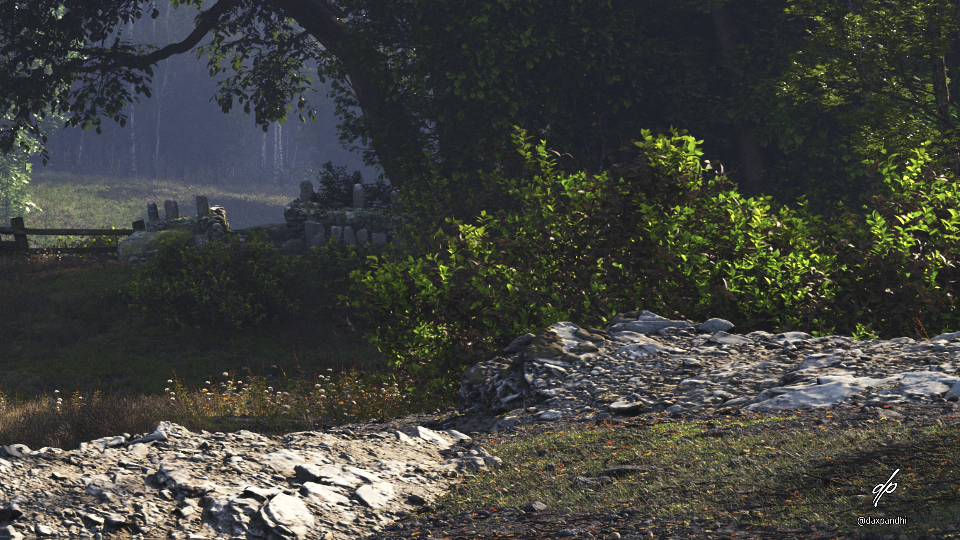
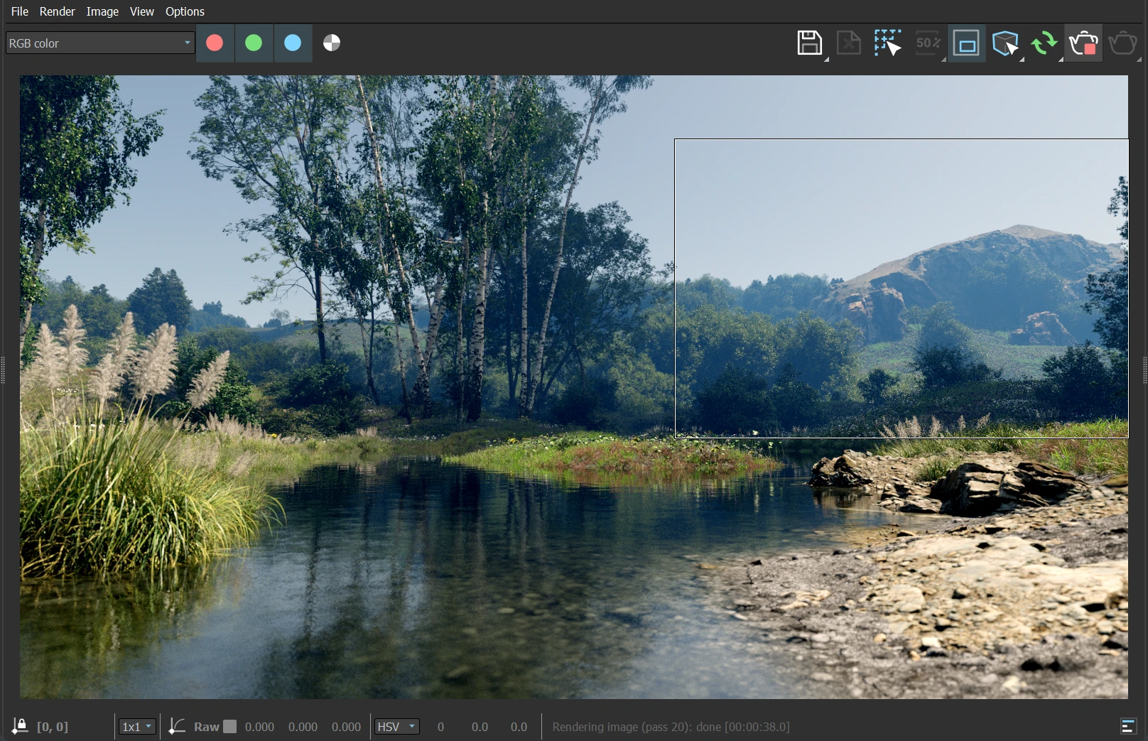
Some of the flatter ScansLibrary rocks were brought back to add some nice rocky extrusions in the pond.
The scene needed life. It also needed a frame of reference for scale. The closest items to the camera are about a centimeter or two, while the farthest distance shows trees as tall as 20 meters! But it was not being conveyed properly.
I brought in some dilapidated fences leading up to a rock cairn in the shadows. The fences were deliberately placed to look like they were dipping into the pond that had overflowed some of its limits. To me, such little touches add a feeling of "rural".

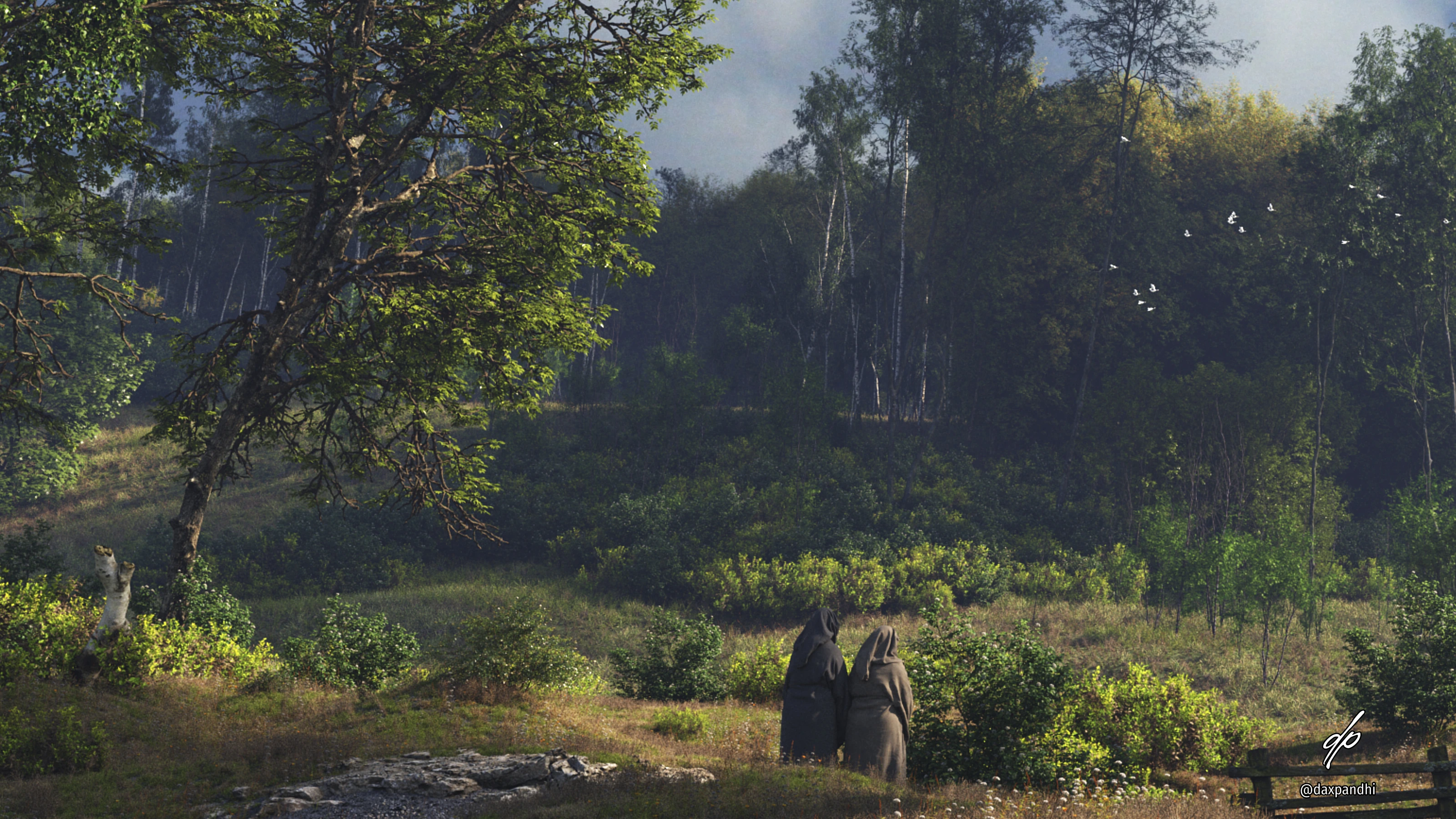
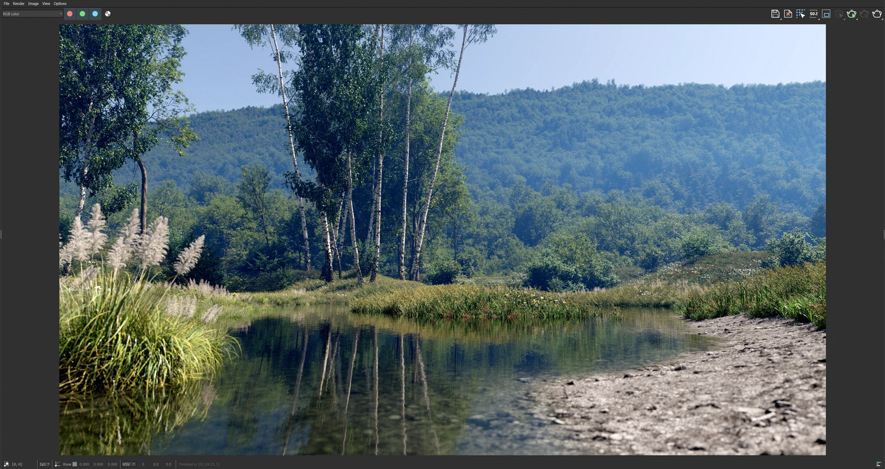
I brought in a short, stocky woman in a brown robe along with a taller woman in a white blouse. This was inspired directly by Disney's Robin Hood - i.e., Maid Marian and Lady Kluck. A little path was made for them to walk on.
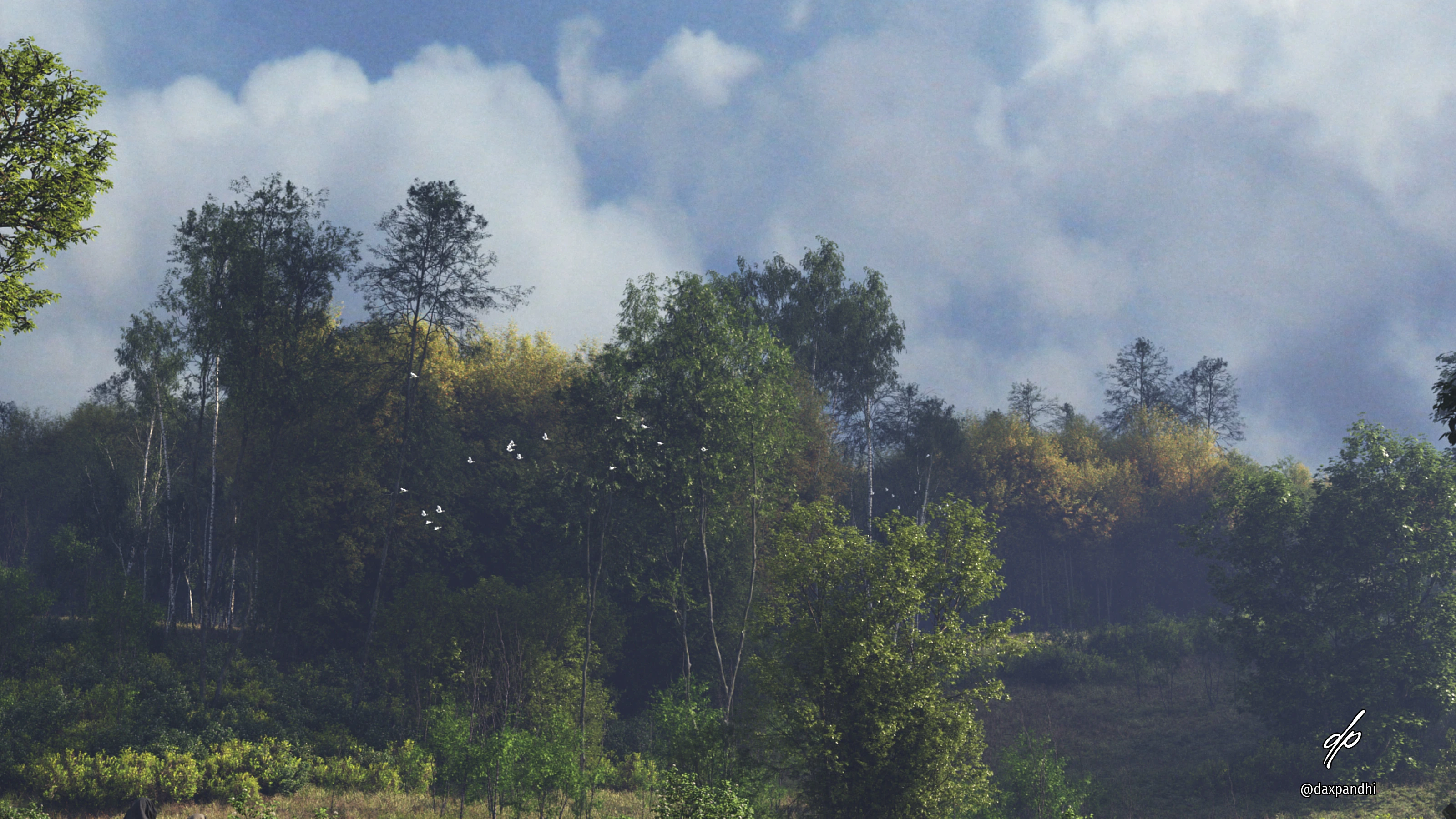
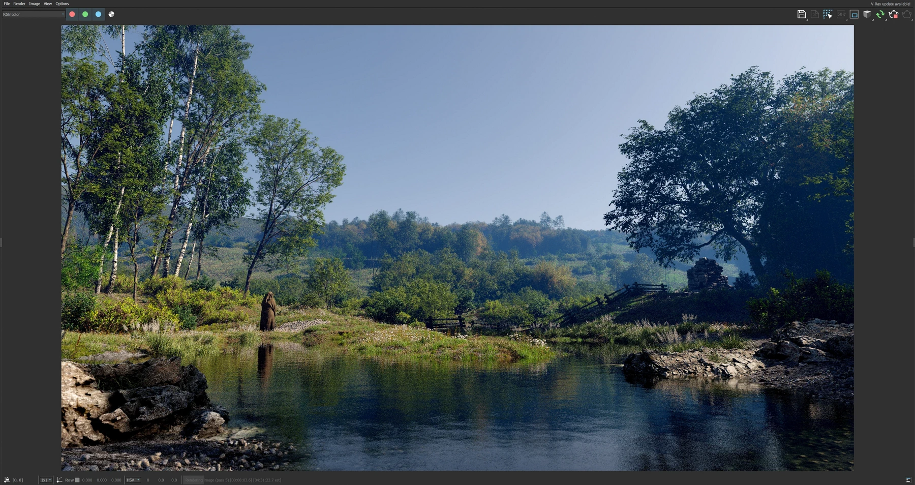
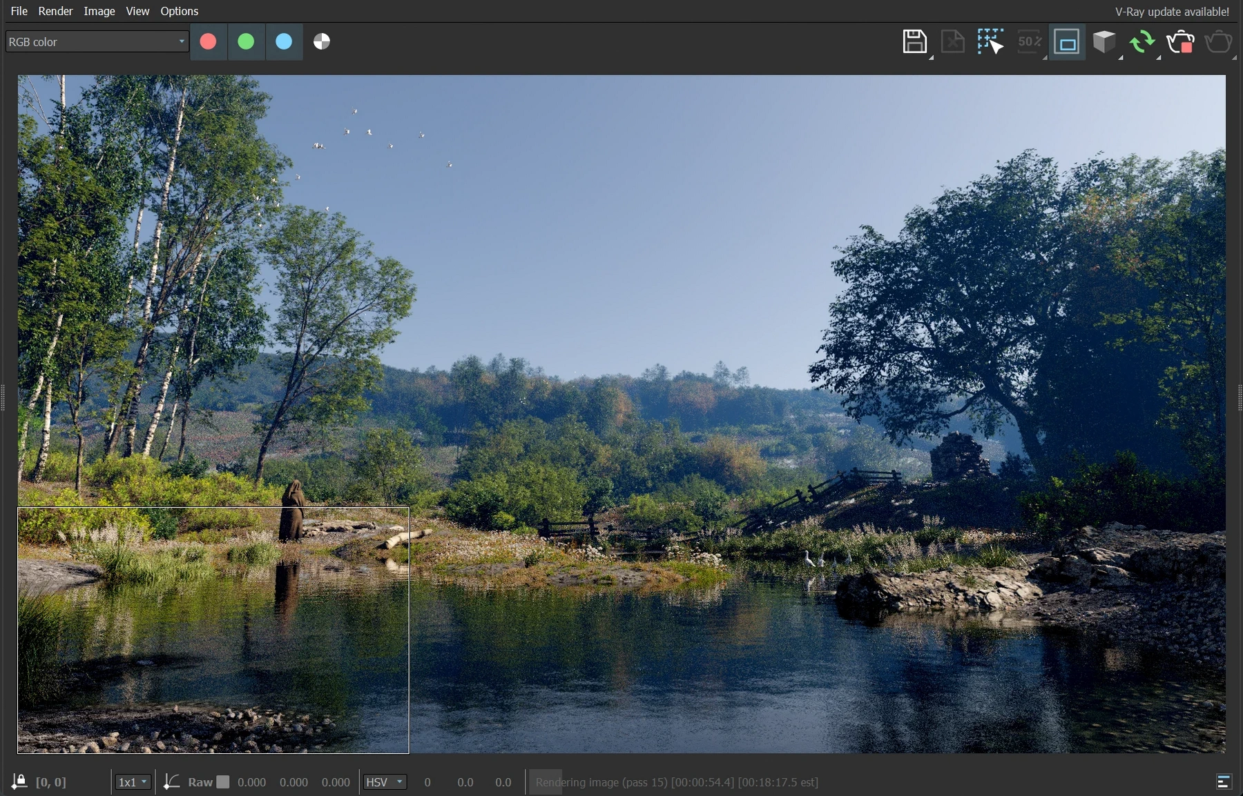
On the far shore, a small group of European Spoonbills was added, while a flock of generic white birds flying out of trees was added to the left large trees, and another far in the forest.
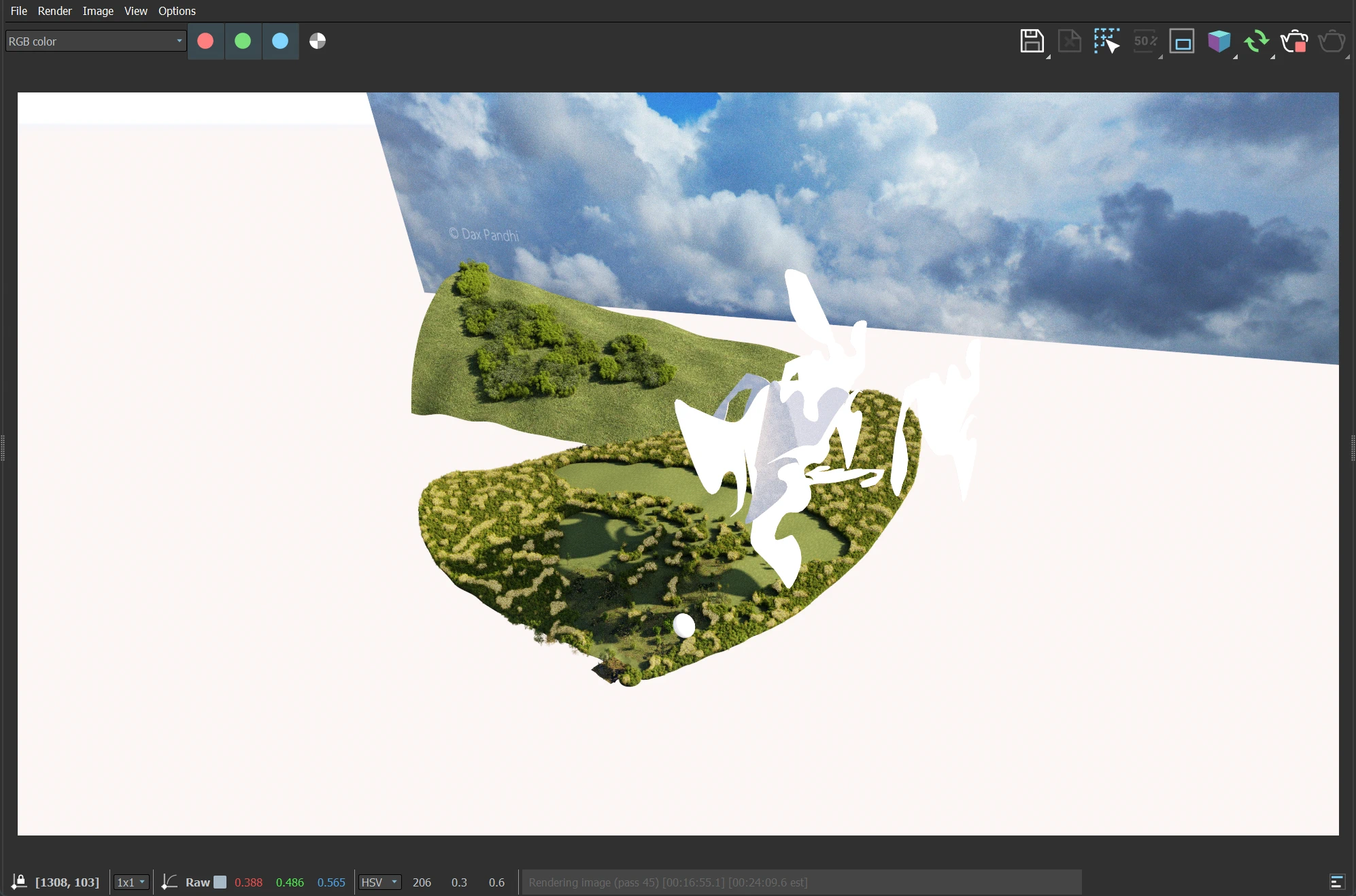
For the background, I wanted a vibrant sky. Without it, the shadowy lighting could look morose. I tried using a background image normally, but it looked off, and the VRay atmospheric perspective was not being applied to it like I'd wanted.
So I made a large 16:9 flat plane in the distance. It was aligned and linked
to the main camera. On it applied my bitmap with 100% self-illumination and
disabled shadowing. The image itself is something I took right here at the
a few years
ago.
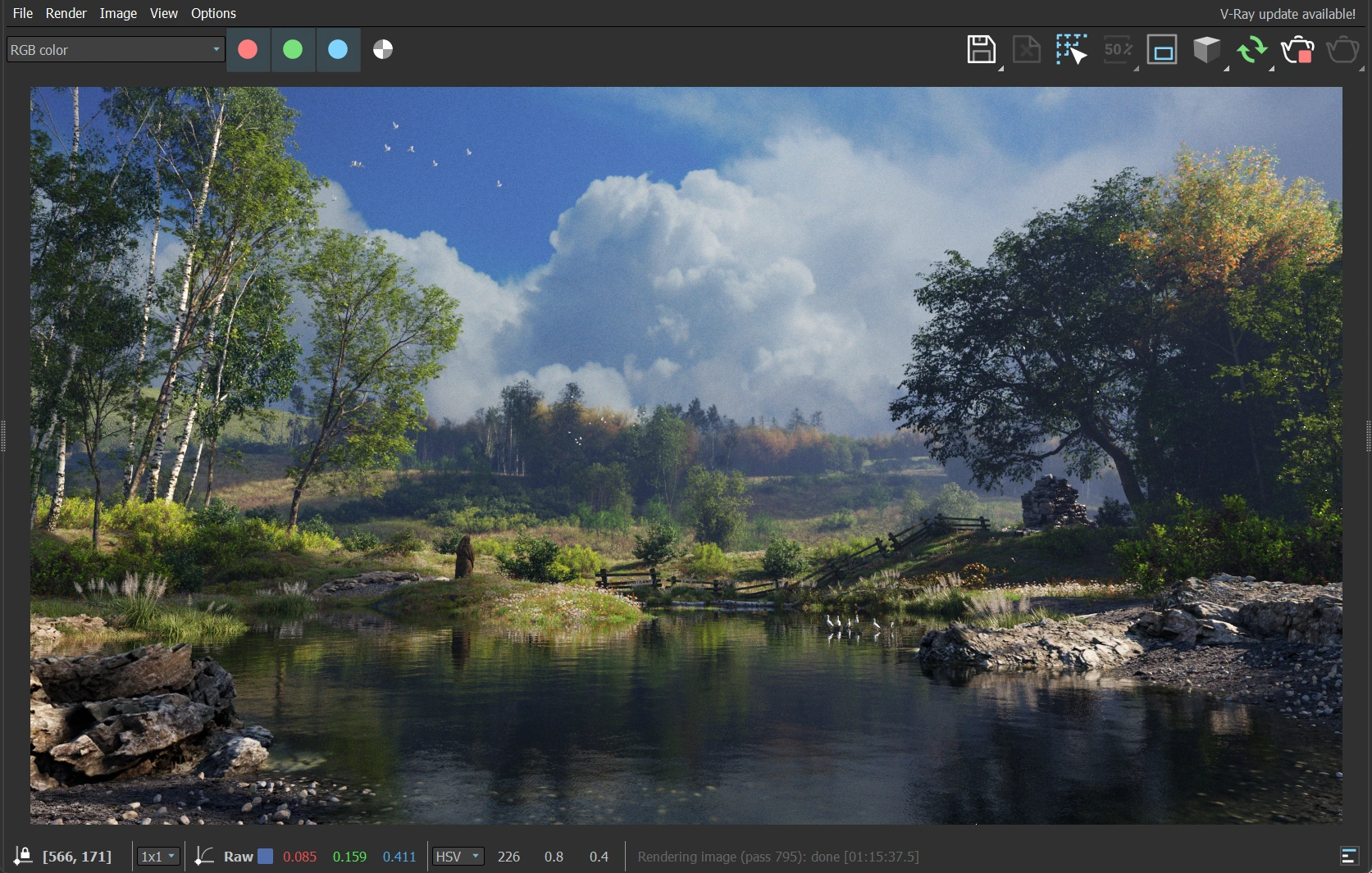
Once everything was starting to come together, I added a lot of smaller details such as varied pebble sizes, sticks, fallen leaves, etc. In some of the barren areas, sparser, thinner grass was added to show new grass expansion as opposed to just reducing the size and density of the main grass at the edges.
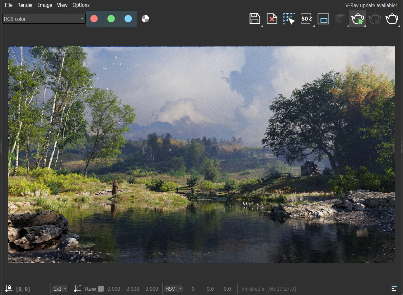
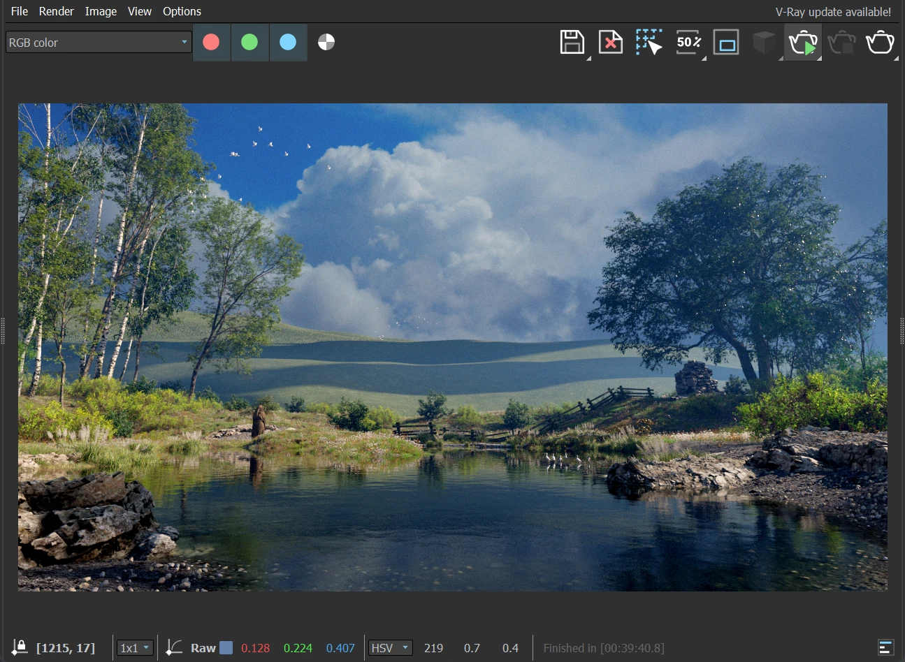
Throughout all these changes, I made several "clouds" or weirdly shaped sunlight blockers and strategically kept changing them to give me the right kind of shadows across the entire scene. These extremely simple objects more or less shape the feel of the scene!
Marian was replaced by another hooded woman. And the rock cairn was replaced by graves. It made more sense to have nuns visiting graves at the edge of a village than two people out on a stroll.
With some more tweaking of shadows and trees here and there in the distance, the scene was finally complete!